
")
In addition to data organization, basic spreadsheet layouts, and performing calculations, Microsoft Excel can serve as a robust tool for making engaging, interactive dashboards. After all, static spreadsheets with endless rows of numbers can be overwhelming at times, and may fail to display and communicate key insights. Here is where interactive dashboards come in to offer you a dynamic way to explore data, spot trends, and make informed decisions.
What is an interactive dashboard in Microsoft Excel?
Before we go over the step-by-step instructions for how to create an interactive dashboard in Microsoft Excel, let’s have a brief word about it. An interactive dashboard carries a combination of charts, graphs, tables, and figures to help shed light on your complex data in an easy-to-read format.
In addition to offering an interface for quick data interpretation, an interactive dashboard also leaves a good impression in front of your stakeholders, professors, investors, or potential customers. Such a one-page dashboard goes beyond a collection of charts and tables to deliver key information and valuable insights to speed up your decision-making process.
For example, if you are a sales manager and want to track your team’s performance in different regions, product categories, and time periods, you can create an interactive dashboard with charts and graphs, pivot tables, slicers, and conditional formatting. After finalizing your dashboard, for example, you can quickly verify whether the quarterly sales target was met or surpassed, along with other important metrics.
The possibilities are endless with interactive dashboards in Excel.
How to create an interactive dashboard in Microsoft Excel
Now that you have a basic idea about interactive dashboards in Microsoft Excel, let’s check them out in action. Before beginning, clearly define the purpose and use case for your dashboard. With this clarity, you can quickly follow the steps and finish the setup task efficiently.
Insert data and create a pivot table (or several!)
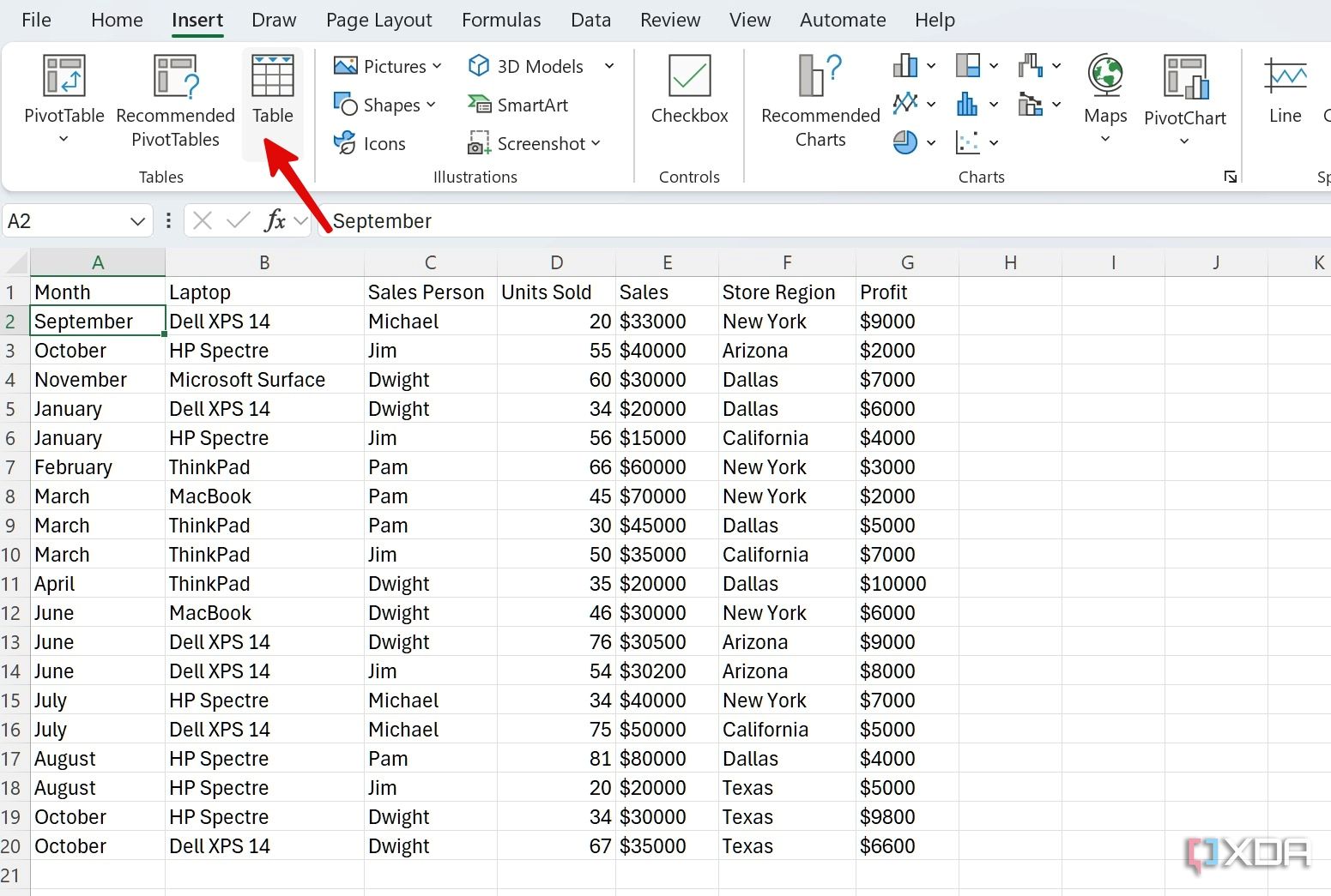
First, generate the raw data set that you plan to use to create an interactive dashboard in Excel. You’ll need to build the data into an Excel sheet first, in table format with headers, then from there we’ll be able to go on to create the pivot tables which will summarize the data based on the categories of your choice. For the sake of example below, let’s take a table with product sales information, and I will demonstrate how to use pivot tables to extract and visualize information such as the Units Sold per Month, Sales generated by Sales Person, or otherwise.
- Create or open a relevant spreadsheet in Microsoft Excel.
- Select your data, then click Insert > Table, to get it all into a nice table format with headers.
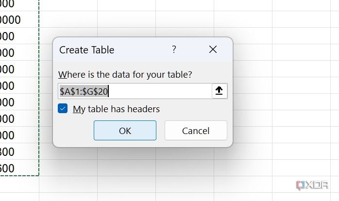
- Enable the check mark beside My table has headers (and, of course, ensure that it does), then click OK.
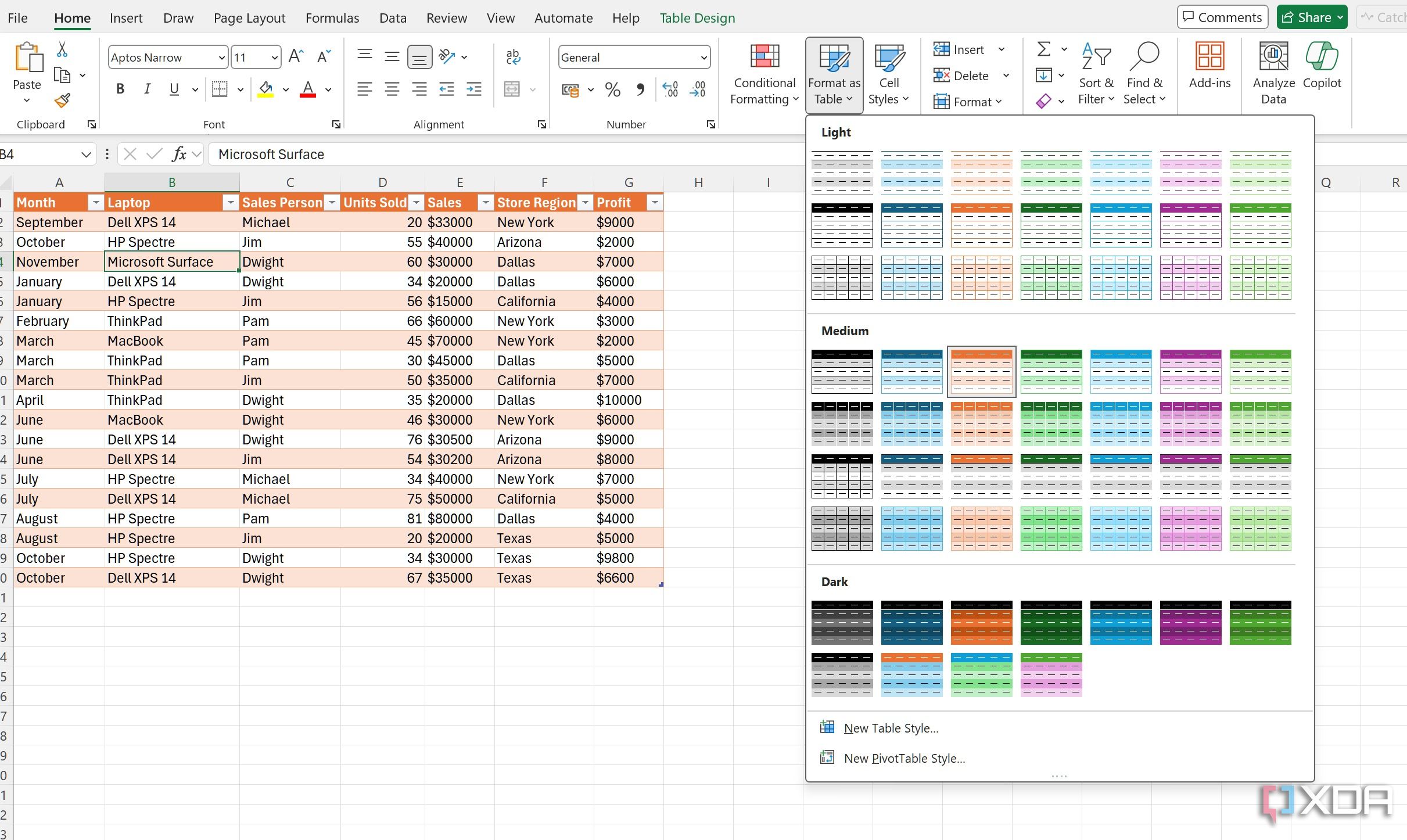
- If you’d like, you can format your table from the top menu to give it a different look (by default, it uses a blue theme).
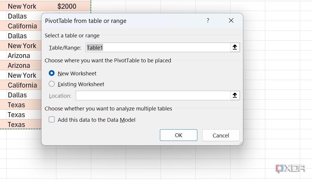
- Now, it’s time to use your table to generate a pivot table (or several) so that you can analyze and see patterns in your data. To do so, head to Insert > PivotTable and select From Table/Range.
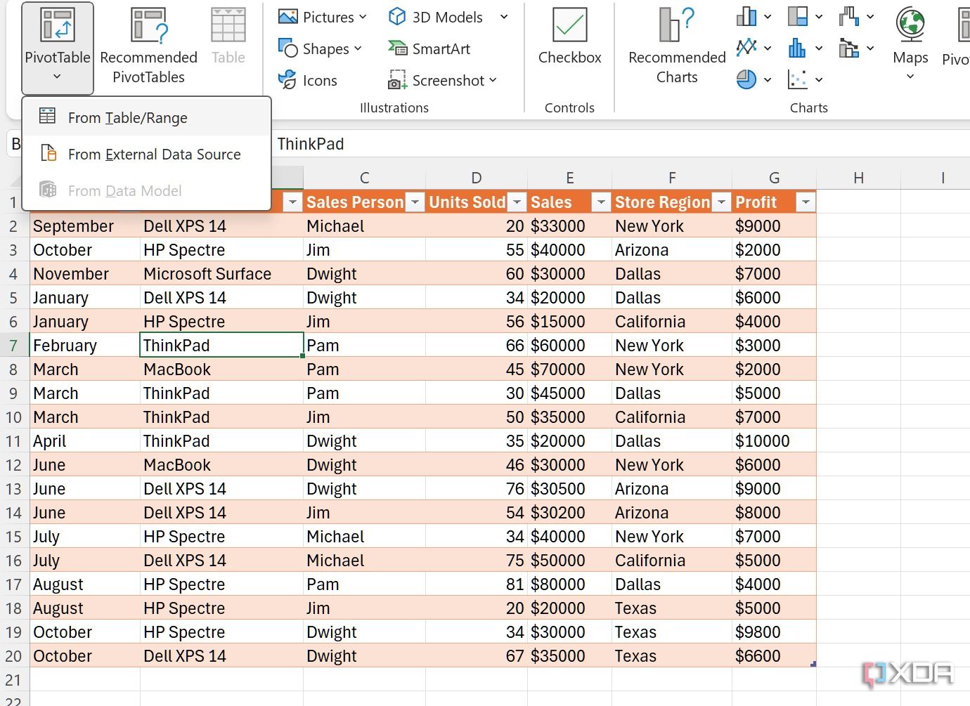
- Give it a relevant name, pick New Worksheet as the location, and click OK.


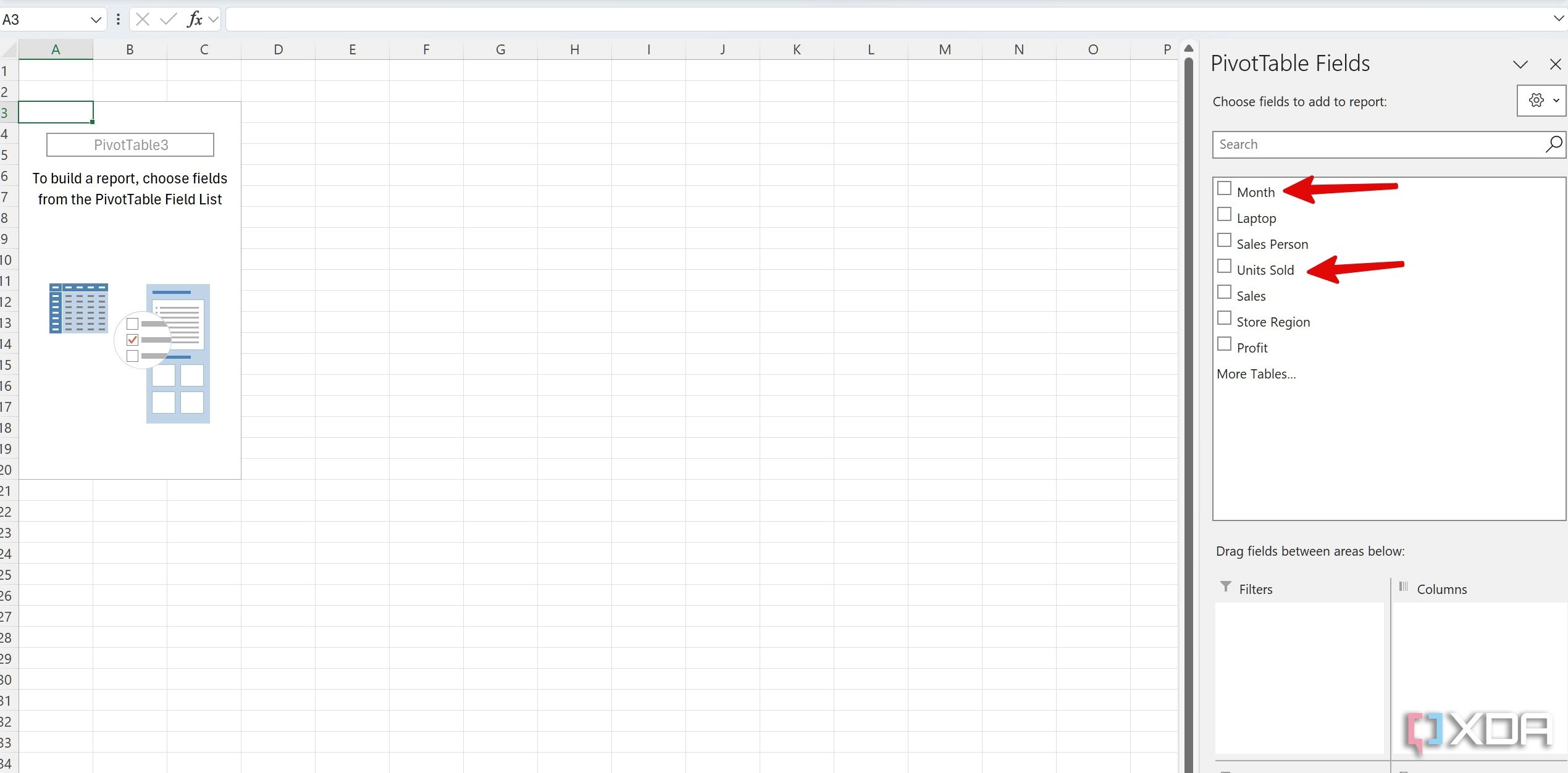
For this example, we will create three charts, so we will need three pivot tables. Rather than repeating the same steps above to make three new pivot tables from scratch, you can simply hold CTRL (or option on Mac) and drag the new worksheet to the right to copy it. Repeat this in order to create three pivot table sheets. For clarity, rename the sheets by using the right-click menu.
Create charts with pivot tables
Now that our three new pivot tables are ready, it’s time to create charts for the dashboard based on the information they contain.
- Once your pivot table is ready, a pivot table field appears on the sidebar. Select the fields you wish to include in the report (which reflect the headers in your original table).
- Let’s select Month and Units Sold.
- Head to the Insert > Charts menu and select the chart type you want to insert. Let’s add a pie chart.
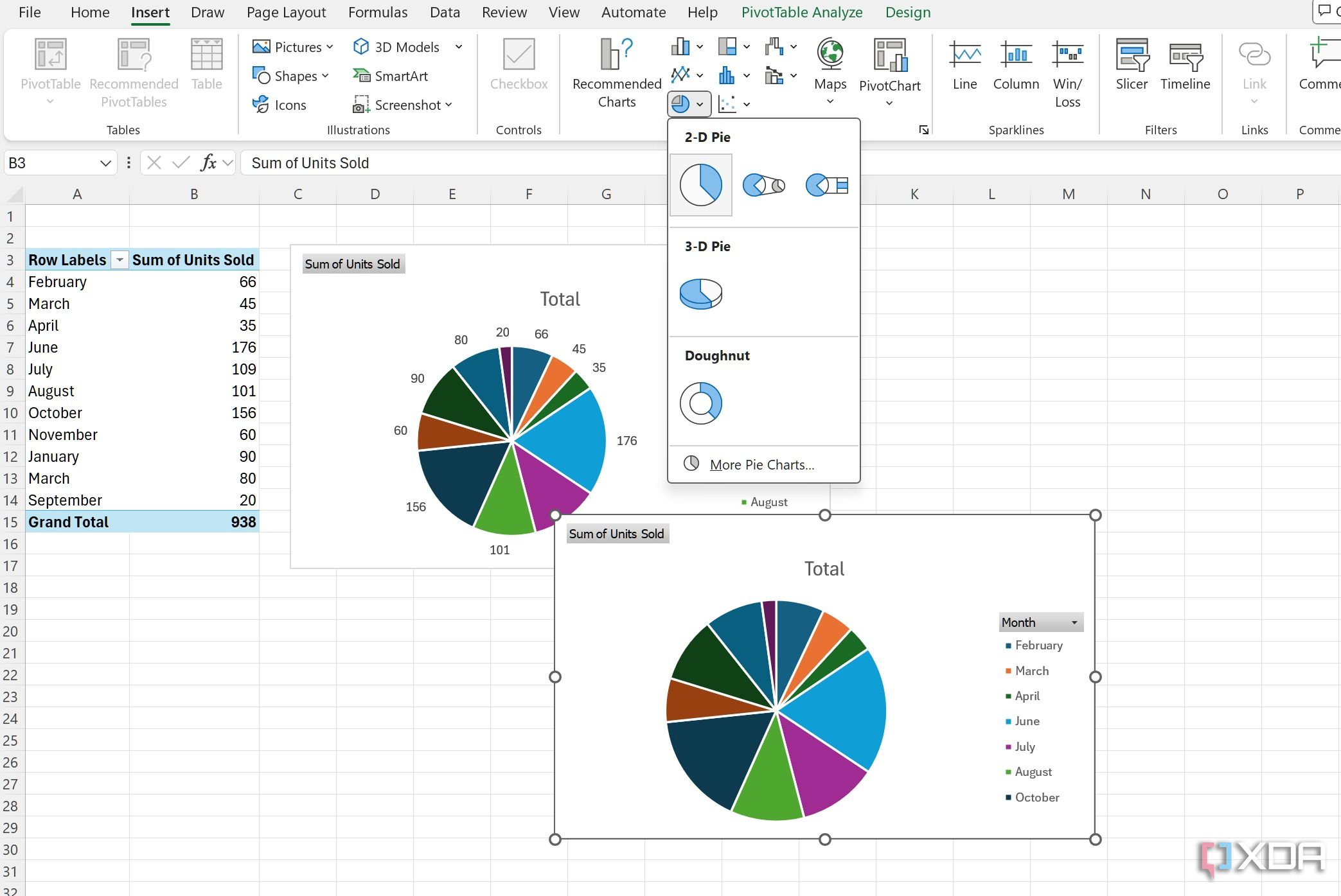
- You can select a chart and click the style icon to change its appearance. You can also click the + icon and tweak the chart elements.
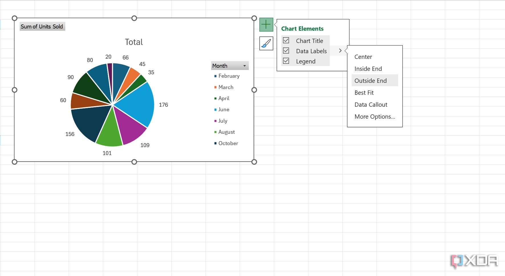


For example, you can add or hide a chart title, change its position, change data labels positioning, and even change the legend’s position. Overall, you have sufficient customization options to get a desired outcome in Excel.
Once you’ve completed your first pivot table, move to another sheet, select your pivot table and insert the relevant fields to create another chart. Here, we have added a column chart.

Repeat the same for the third sheet, select the desired fields, and add a chart. We have added an area chart here. The steps are identical to those discussed in the section above.

Don’t forget to play with chart elements in every chart type, if you do not prefer the default style and appearance.
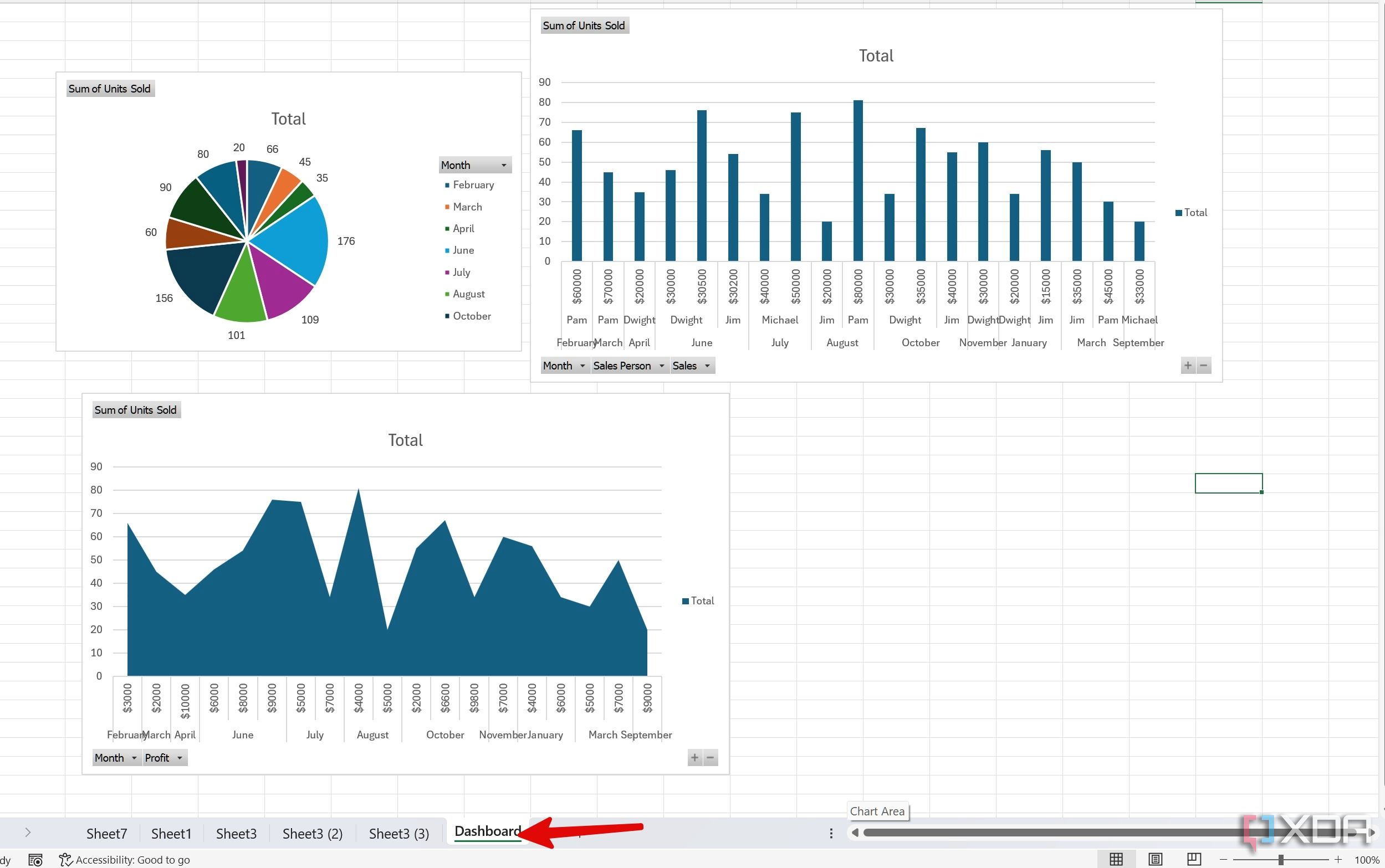
Create a central dashboard
Once your pivot table charts are ready, it’s time to assemble them into a single sheet.
- Click the + icon at the bottom of the file to insert a new sheet. You can right-click on it to rename it Dashboard.
- Copy the pivot charts from the other sheets and paste them on the dashboard.
- You can rearrange them to fit your preferences and create a uniform look.

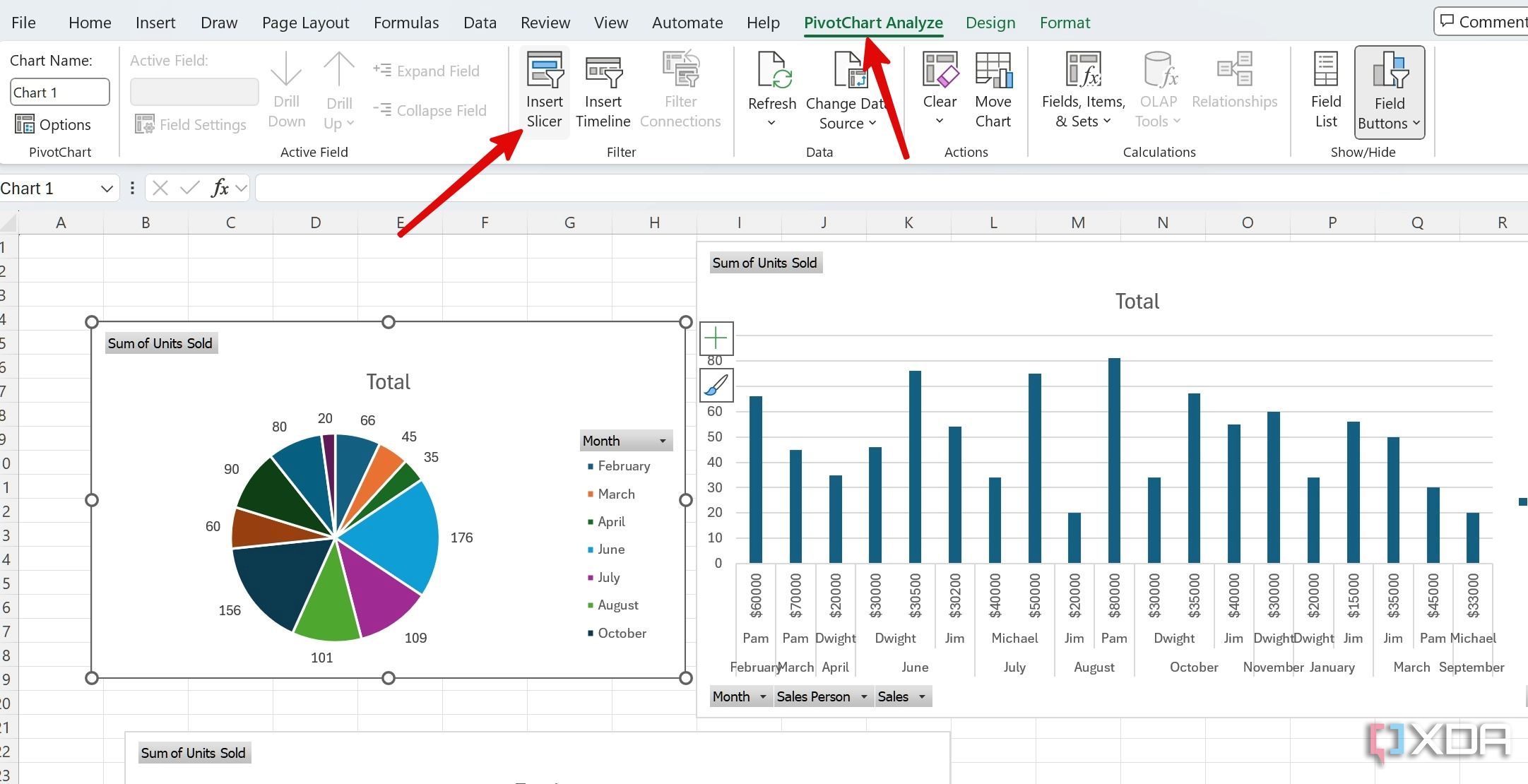
Pro tip: Add Slicers to your dashboard
You can also add filters in the form of Slicers to an Excel dashboard. Power users can interact with the dashboard and filter relevant data in no time. Here, we will add a Slider for the sales team so that we can check each employee’s sales performance with a single click.
- Select any pivot chart on your Dashboard. Slide to the PivotChart Analyze.
- Select Insert Slicer.
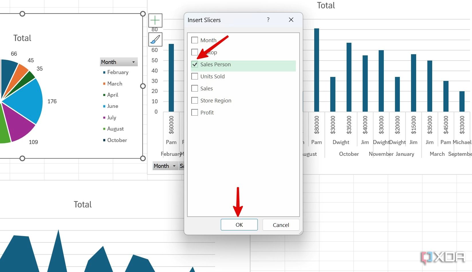
- Click the check box beside Sales Person and hit OK.
- Place the Slicer in a specific place. As of now, your Slicer is only connected to the selected chart. We’ll need to make sure to connect it to the data in the other pivot charts, too, in order to slice the data across the board, capturing all metrics for the same employee in this case.
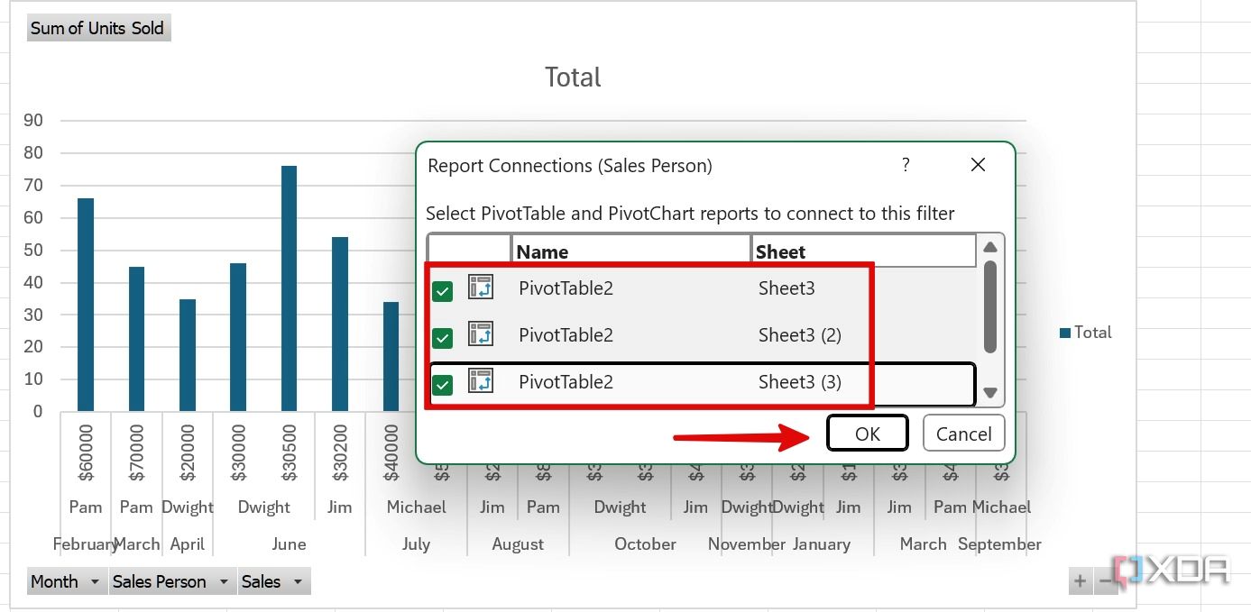
- Right-click on a Slicer and select Report Connections.
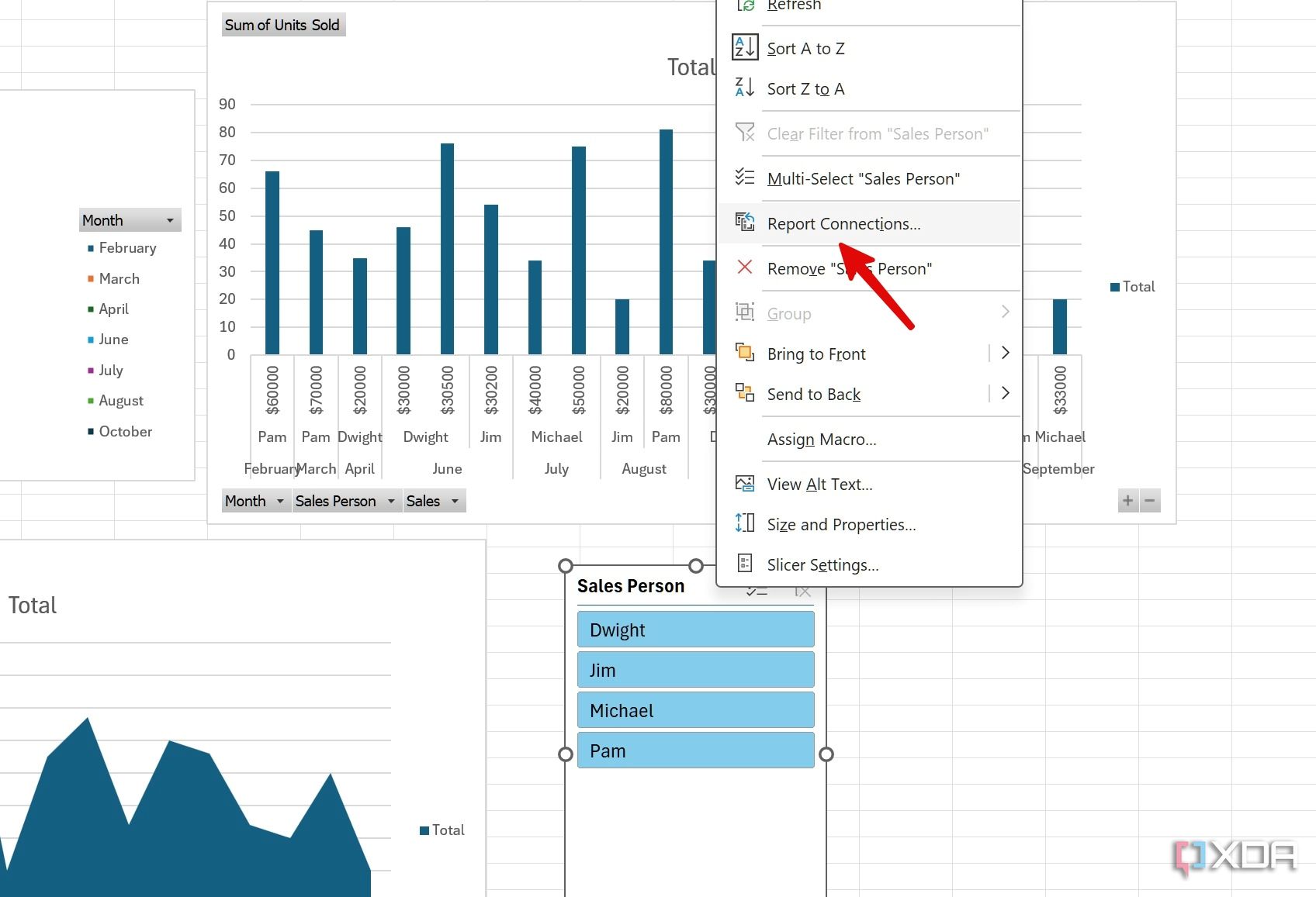
- Select the other related pivot tables and click OK.
- Now, you can click on any sales person’s name and check their relevant metrics in real time.


When we click on Jim, the dashboard shows how many units he has sold monthly and how much profit and revenue he has generated, across all categories which are visualized on your Dashboard.

Reasons to make interactive dashboards with pivot tables
Are you still of two minds about using an interactive dashboard in Excel? Here are some of the key advantages of building dynamic dashboards in Microsoft Excel.
- Better data exploration: With Slicing and dynamic filtering, you can review hand-picked data based on specific criteria for the metrics you wish to see.
- Enhanced decision-making process: It delivers real-time insights and allows decision-makers to react quickly to ever-changing circumstances.
- Increased productivity: It boosts efficiency and frees up valuable time for analysts.
- Cost-effective: Thanks to this built-in functionality in Excel, you don’t need to rely on other software programs to generate such interactive dashboards, it’s something that you can easily create and maintain yourself.
Make data-driven decisions
From basic charts and graphs to advanced pivot tables, you have multiple options to create a personalized dashboard in Excel. Get started by using the tricks above to transform your basic spreadsheets into dynamic dashboards, which will offer you and your team a deeper understanding of those endless numbers in rows and columns.
Starting a spreadsheet from scratch can be a time-consuming affair. If you have more projects to tackle, here are the top free Excel templates to set up other useful worksheets in no time.
#interactive #dashboards #Microsoft #Excel
source: https://www.xda-developers.com/how-you-can-make-interactive-dashboards-in-microsoft-excel-and-why-you-should/

